NomNomNom
PRESSURE COOKER PROJECT FOR A NEW ERA OF FAST FOOD
Fast food has a certain kind of magic around it. It’s the treat after a long drive, with the kids in the backseat screaming for McDonald’s. Or the anticipation for the delivery guy to show up with your meal, that you had to do nothing for but order. It’s the craving, the satisfaction of a delicious, indulgent meal. With Nom Nom Nom all of that changes. Nom is redefining the term ‘fast food’ and turning the whole category upside down. “Out” with the grease, but “in” with the convenience, the prices and amazing and healthy quality.
A pressure cooker process together with the ambitious entrepreneur Ruben Vermijs. And an identity that quotes yesterday’s fast-food industry and fearlessly turns it upside down. We concepted and designed a brand identity from scratch. And created everything a new Fast Food brand needs: from packaging to a mini campaign to support in the creation of 5 pop-up stores in Amsterdam.

BRAND IDENTITY: PURISM MEETS PUNK
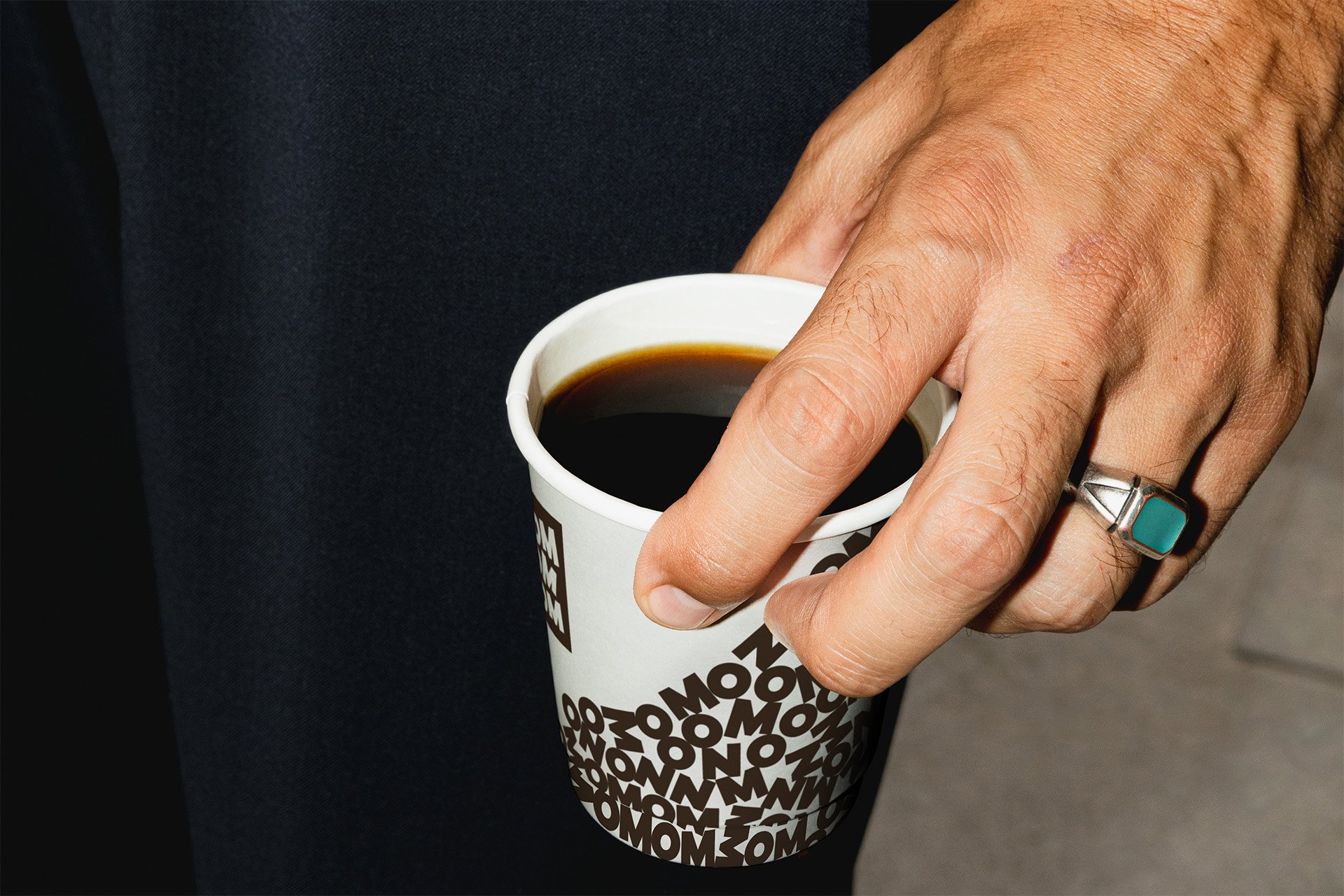
Nom enables you to eat an unlimited amount of fast food. This is what our visual identity is based on: the possibility of excess paired with purism. Because Nom is not only free of fats and flavor enhancers, but also based on a very limited number of ingredients. We have visualized this in bold, but nevertheless puristic-looking letter artwork. These quote the consistencies of Noms products: Stacked, Liquid and Chunks.
Simultaneously we broke with the puristic look by quotations of the old fast food industry, such as red straws. And consciously decided for a packaging design that is intentionally not perfect .
THE TEAM
Brand Identity and Design Direction: Katharina Goetzendorfer, Yvonne Mak, Designer: Ejla Miletic, DTP and Design: Jeroen Giesen, Copy: Pim Smeets, Strategy: Nino Stoffels, Projectmanagment and Production: Claudine Wijsmuller, Inti Spijker


